UX/UI Design · Product redesign · Enterprise
SNCF
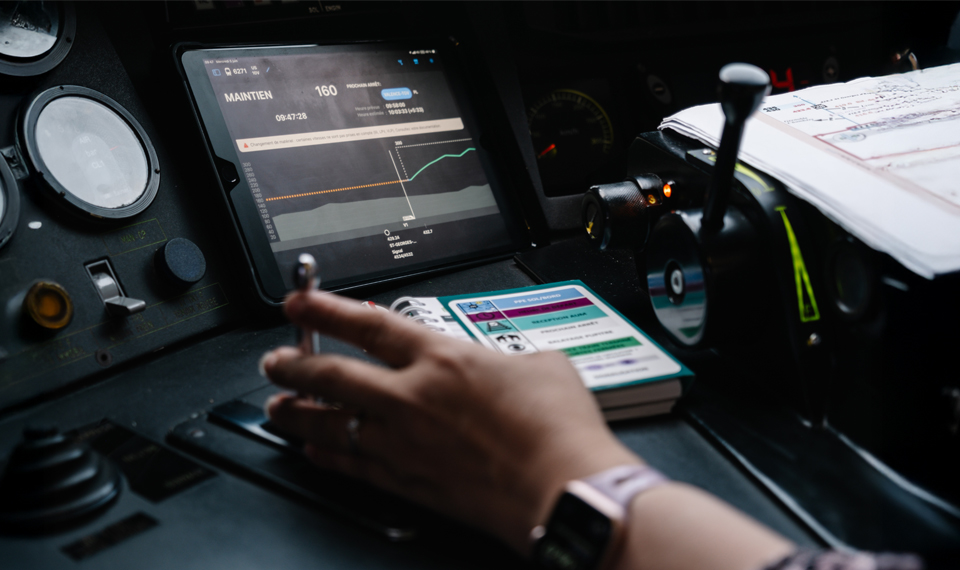
An internal iOS mobile app for SNCF (the French national railway) built for train drivers, used daily by around 15,000 train drivers. It replaces traditional paper documents and brings together in a single tool the train sheet, reference timetables and speeds, technical information and line handbooks, as well as driving aids such as eco-driving or indicative speeds, right through to the service report filled in at the end of a shift.
Client
SNCF
Role
Lead UX/UI Designer
Duration
18 months
Deliverables
Workshops, mockups, QA specs
01
Context & Problem
The application had already existed for about ten years. Two observations drove its redesign: an aging user experience, designed for usages and an operating system that had evolved considerably since, and code that had become difficult to maintain on the development side.
How can we modernize a critical application used daily by 15,000 drivers, without disrupting their habits or ever compromising driving safety?
The challenge, then, wasn't to start from a blank page, but to rebuild a critical application, used in real driving conditions, without losing the working habits of 15,000 drivers used to the existing tool.
02
Approach
I took over from an agency colleague already on the project, with a phase spent getting up to speed on the business and project context, an ecosystem with many stakeholders: PO, PPO, PM, developers, subject-matter experts, and an Apple engineer dedicated to iOS guidelines.
To ground design decisions in the reality of the job, I did shadowing sessions in train cabs alongside drivers, to concretely understand their challenges, their friction points with the existing tool, and their real needs, an essential step on a product as far removed from my everyday life as train driving.
The interfaces had to comply as closely as possible with Apple's Human Interface Guidelines, for maintainability and development-constraint reasons. Bi-monthly check-ins with an Apple engineer helped decide which components to use and verify that the interfaces complied with the guidelines.
One challenge was implementing dark mode: the native mode simply inverts colors, which wasn't enough to guarantee consistency and visual comfort on an application used at night in the cab. I had to design custom adaptations rather than rely on automatic inversion.
The pace of production was demanding: priorities often changed based on functional directions given by the PM, which required continuous adaptation rather than following a fixed roadmap. I ran mockup presentation meetings to gather feedback and iterate, as well as co-design workshops with subject-matter experts, remotely and in person in Paris, exchanges that required as much patience and listening as pedagogy, with a mentoring dimension for some stakeholders less familiar with product design methods.
+1,000
screens designed over the course of the project
18
months on the mission, through to handover
~15,000
drivers using the application
03
Result
At the end of the mission, I handed over a complete package to the colleague taking over, including mockups, co-design workshop reports, and validation QA specs.
- — A significant skill increase in a very specific field (train driving) and in the technical constraints of Apple's Human Interface Guidelines.
- — Full autonomy in managing a major client and a project with strong regulatory and technical constraints, with a proactive posture of identifying needs rather than simple execution.
- — A proven ability to run workshops and lead change management with business stakeholders unfamiliar with product design methods.