UX/UI Design · Design system · Branding
Terry
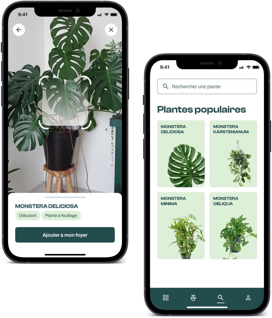
Terry is a mobile app concept that helps users care for their houseplants according to their skill level: watering reminders, tips and tutorials, and an estimate of the best spot for a plant in the home through home modeling and weather simulation.
Context
Final-year project
Role
UX/UI Designer
Duration
9 months
Deliverables
App and landing page mockups, design system
01
Context & Problem
A final-year project completed solo as part of my M2 UX/UI Design at ECV Nantes (2023), I imagined and designed a companion app for houseplant care along with its associated design system. The brief asked us to imagine a startup context with several departments (design, marketing, development), so I carried out the entire process alone, from UX research through to the design system, while accounting for the needs of these fictional stakeholders.
How can we support people, whatever their level, in caring for their houseplants?
The starting observation: a large number of houseplants die every year, from lack of knowledge, lack of attention, or because their care ends up feeling like a chore.
To validate this observation, I ran a quantitative survey distributed across several platforms, complemented by qualitative interviews with 7 people selected among the respondents.
264
survey responses in 15 days
95.5%
own houseplants
67.9%
said they were interested in the concept
The interviews surfaced clear needs (knowing your plants, reminders, reliable advice) as well as points of caution: not multiplying features, avoiding too many notifications, and ensuring information came from trustworthy sources.
02
Approach
This research led to three personas, each representing a different level of expertise, which guided every design decision:
- — Enzo: a young beginner with no green thumb at all
- — Diane: a young intermediate who enjoys looking after her plants
- — Carine: an experienced older woman who loves nothing more than taking care of her plant collection
The information architecture followed several steps: a feature list sorted by theme and prioritized into V1/V2 (community features were pushed to V2), a sitemap for the app and landing page, a user flow, then a user journey built around Diane to spot friction points in her path (adding a plant to her home).
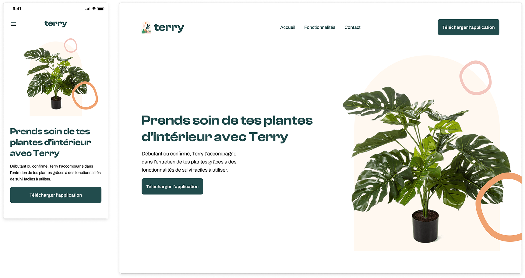
The project is built around three values: personalization, education, and environmental responsibility. These are reflected in a complete brand identity: color palette, typography (Clash Display for headings, Archivo for body text), patterns, and logo.

Detailed wireframes then structured the key journeys (sign-up, onboarding, dashboard, plant detail, household management, search), before moving on to high-fidelity mockups and a responsive landing page.
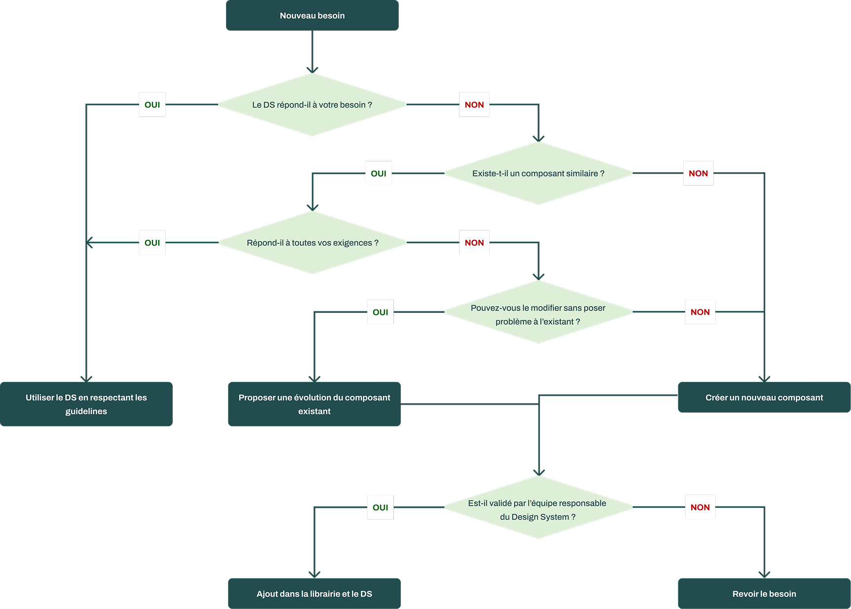
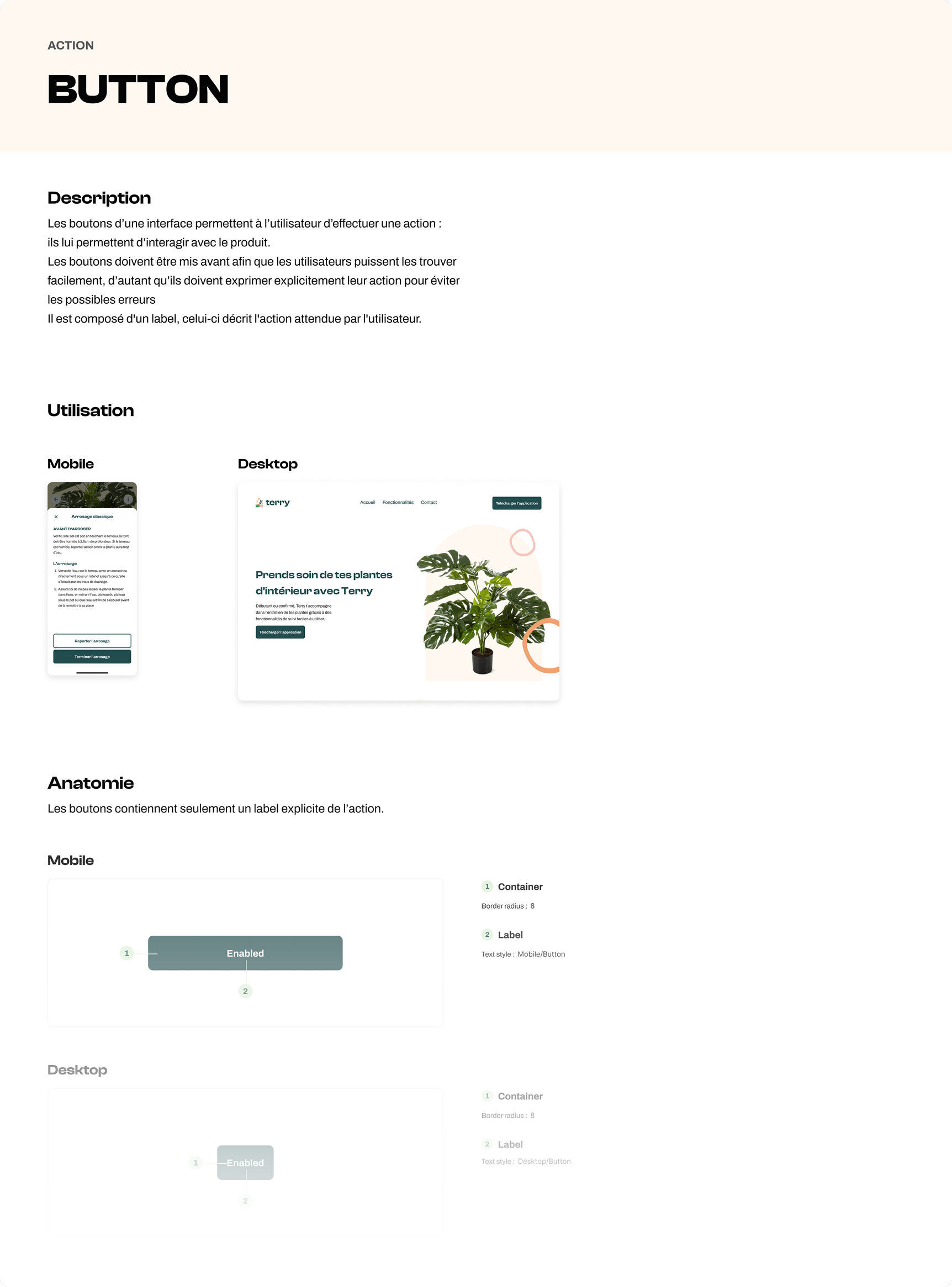
On the Design System side, I built a Figma library organized by component category (actions, navigation, forms), each documented with its anatomy, use cases, and do's/don'ts. To keep the design system under control over time, I set up a decision tree to determine whether a need corresponds to an evolution or a new component, either way, going through a validation step before being integrated.
Finally, I centralized this documentation on ZeroHeight, designed to be accessible to several stakeholders (design, development, marketing), and set up design tokens exported in JSON to make future implementation by developers more reliable.
03
Result
The project resulted in a complete, testable prototype (app + landing page) and a documented, governed design system, built to keep evolving:
- — A validated concept, backed by user research rather than intuition: 67.9% of respondents said they were interested in the concept before the screens were even designed.
- — A documented Figma component library, with exportable design tokens, to streamline collaboration with development.
- — A governance process (decision tree) preventing the proliferation of redundant components.
- — Centralized documentation on ZeroHeight, shared across design, development, and marketing.
A V2, incorporating the community angle identified during research (other users' profiles, plant sitting), had been planned on the project's end-of-project roadmap.